
जब हम binary classification करते हैं (जैसे spam/not-spam, disease/healthy), तो हमें सिर्फ accuracy से model की गुणवत्ता नहीं पता चलती। ऐसे में ROC-AUC Curve model के prediction scores को analyze करने में मदद करता है।
🔶 ROC का अर्थ:
ROC = Receiver Operating Characteristic
यह एक graphical plot है जो बताता है कि model कैसे विभिन्न thresholds पर perform करता है।
📈 ROC Curve Plot:
- X-axis → False Positive Rate (FPR)
- Y-axis → True Positive Rate (TPR)
Threshold को 0 से 1 तक vary करते हुए हम विभिन्न FPR और TPR को plot करते हैं — और वो बनाता है ROC curve.
📐 Formulae:
✅ True Positive Rate (TPR) aka Recall:

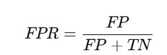
✅ False Positive Rate (FPR):
🔷 AUC का अर्थ:
AUC = Area Under the Curve
यह ROC curve के नीचे आने वाले क्षेत्र का मान है।
AUC का मान 0 और 1 के बीच होता है:
| AUC Score | Meaning |
|---|---|
| 1.0 | Perfect model |
| 0.9 – 1.0 | Excellent |
| 0.8 – 0.9 | Good |
| 0.7 – 0.8 | Fair |
| 0.5 | Random guess (no skill) |
| < 0.5 | Worse than random (bad model) |
✅ Python Code (Scikit-learn + Visualization):
from sklearn.datasets import make_classification
from sklearn.linear_model import LogisticRegression
from sklearn.metrics import roc_curve, auc
import matplotlib.pyplot as plt

# Sample data
X, y = make_classification(n_samples=1000, n_classes=2, n_informative=3)

# Train model
model = LogisticRegression()
model.fit(X, y)

# Get predicted probabilities
y_scores = model.predict_proba(X)[:, 1]

# Compute FPR, TPR
fpr, tpr, thresholds = roc_curve(y, y_scores)

# Compute AUC
roc_auc = auc(fpr, tpr)

# Plot
plt.figure(figsize=(8,6))
plt.plot(fpr, tpr, label=f'ROC Curve (AUC = {roc_auc:.2f})')
plt.plot([0, 1], [0, 1], 'k--', label='Random Guess')
plt.xlabel('False Positive Rate')
plt.ylabel('True Positive Rate')
plt.title('ROC-AUC Curve')
plt.legend()
plt.grid(True)
plt.show()
📊 ROC vs Precision-Recall Curve:
Title Page Separator Site title
| Feature | ROC Curve | Precision-Recall Curve |
|---|---|---|
| Focuses on | All classes (balanced data) | Positive class (imbalanced data) |
| X-axis | False Positive Rate | Recall |
| Y-axis | True Positive Rate (Recall) | Precision |
✅ Imbalanced datasets पर Precision-Recall Curve ज़्यादा informative हो सकता है।
📄 Summary Table:
| Concept | Description |
|---|---|
| ROC Curve | TPR vs FPR plot for various thresholds |
| AUC | ROC Curve के नीचे का क्षेत्र |
| Best Case | AUC = 1.0 (Perfect classifier) |
| Worst Case | AUC = 0.5 (Random guessing) |
| Use Cases | Binary classification performance check |
📝 Practice Questions:
- ROC Curve में X और Y axes क्या दर्शाते हैं?
- AUC का score किस range में होता है और उसका क्या मतलब है?
- ROC और Precision-Recall Curve में क्या अंतर है?
- ROC curve कैसे बनता है?
- क्या AUC metric imbalanced datasets के लिए reliable है?